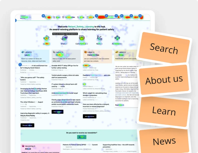
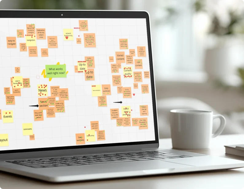
Our approach was rooted in data and a deep understanding of user behaviour. We began by analysing heatmaps to see precisely where users were clicking, informing our decisions on how to restructure the homepage to better meet their needs.
Following a lightning gallery exercise, where we identified elements of competitor sites the psl team admired, we created an initial ‘block plan’ structure. This foundational plan, backed by our research, was agreed upon with the client and guided the design process.
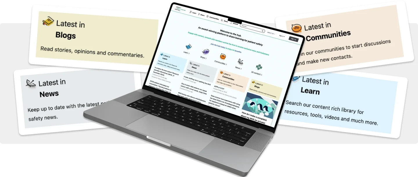
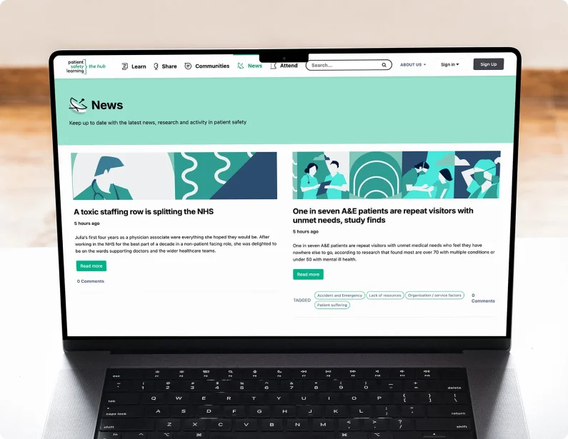
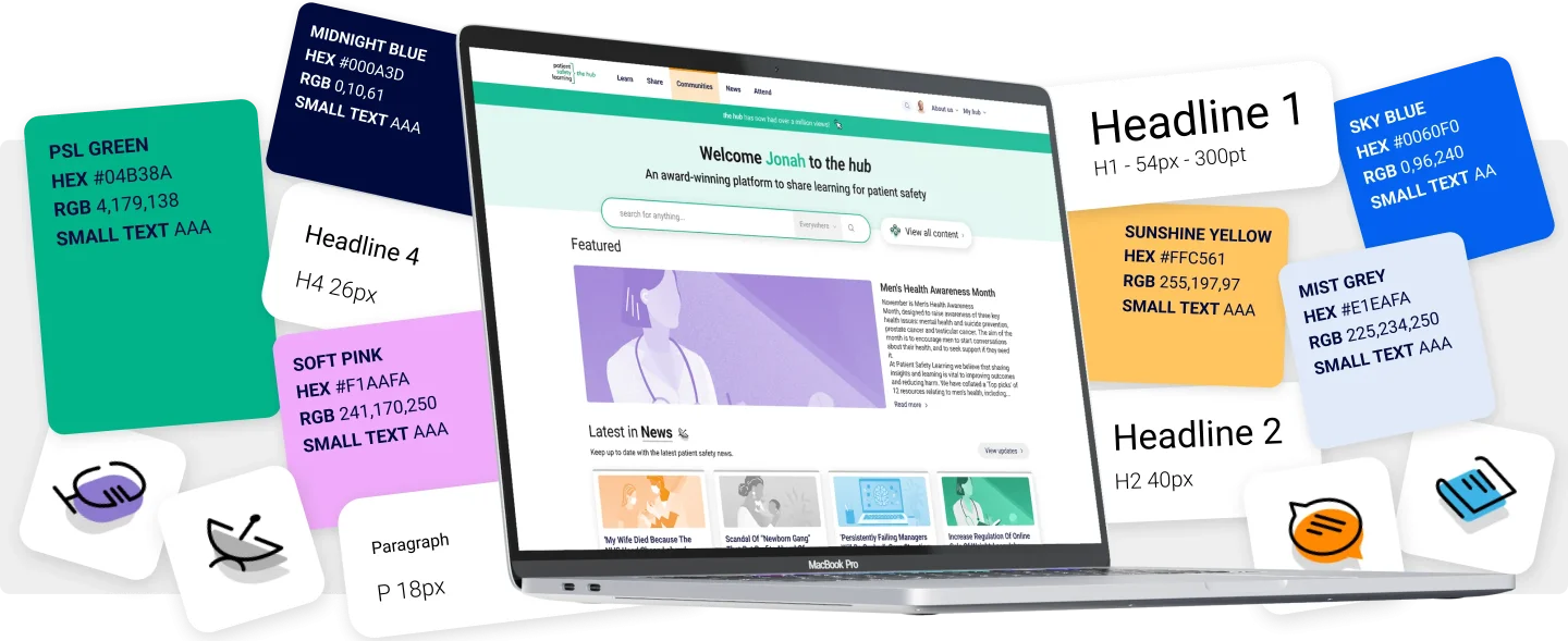
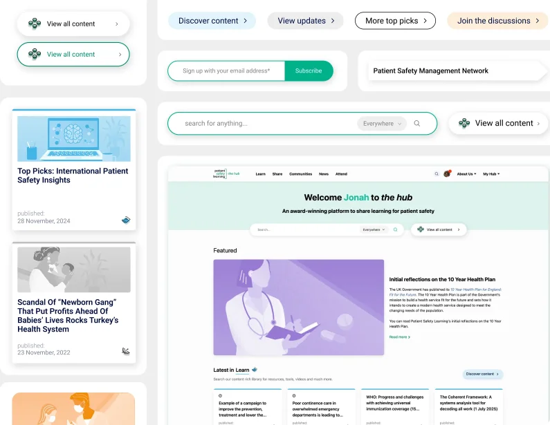
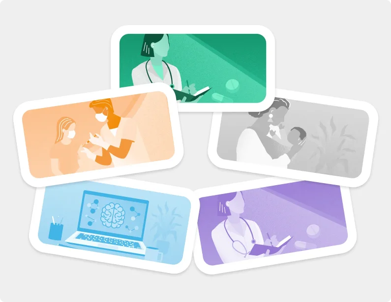
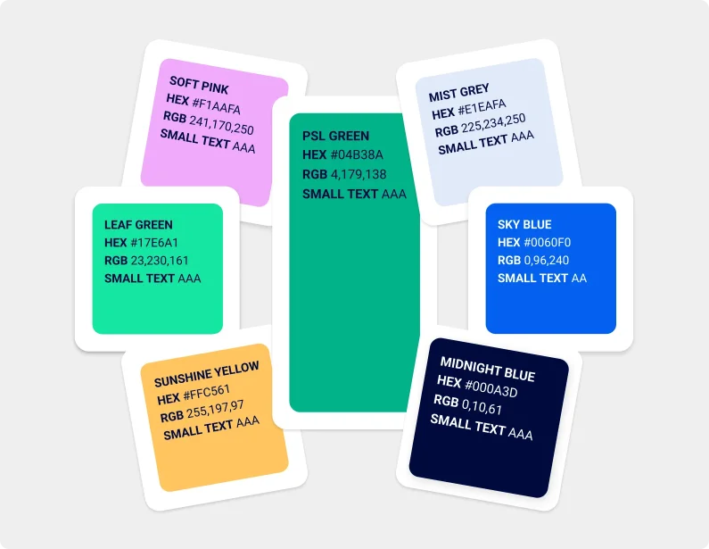
To address the core design and usability issues, we delivered a modern, intuitive interface. By leveraging Patient Safety Learning’s brand colour palette, we created clear visual distinctions between different types of content. The homepage was stripped back and decluttered, introducing dynamic ‘content cards’ to make information more engaging and digestible. To complement this, we designed a new bank of colour-coded illustrations, evolving the existing style to be more organic and approachable. This new asset library brings a fresh, modern feel across the entire website—not just the homepage—without requiring page-by-page development.
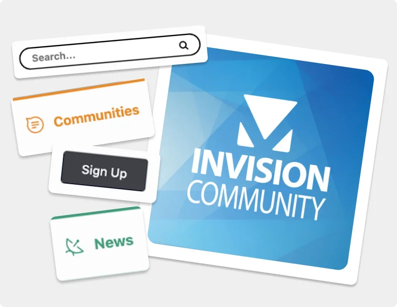
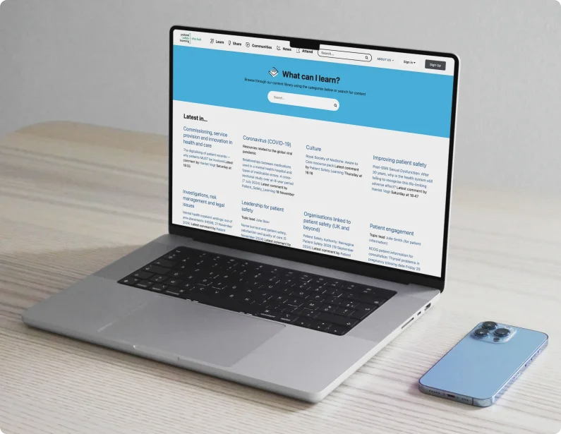
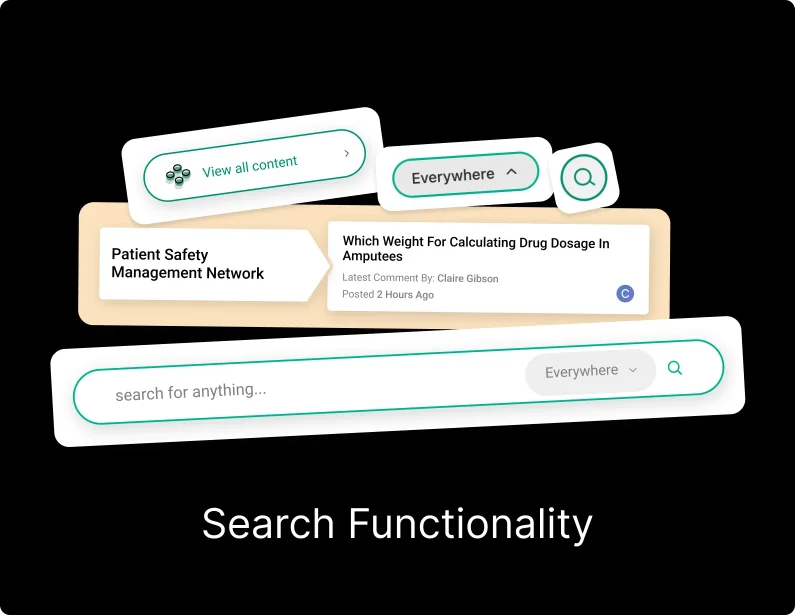
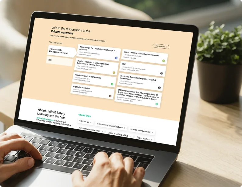
A key priority was making content easier to find. We moved the search functionality front and centre, placing it in the main navigation header to make it instantly accessible across the entire site. We also added a prominent search bar to the homepage hero banner and gave users the ability to search across all content or filter by specific types, dramatically improving discoverability.
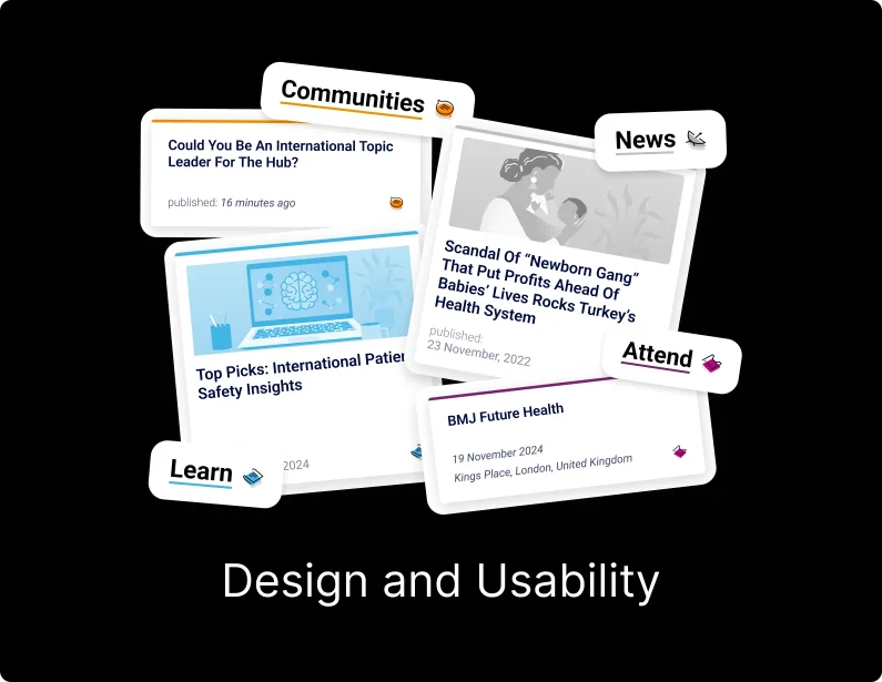
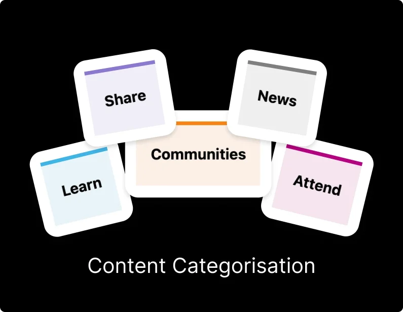
Finally, we addressed content categorisation by shifting the homepage from a long vertical list to a horizontal, card-based layout. This new structure prioritises key Learn and News articles before guiding users to other sections. For users belonging to private networks, we introduced bespoke feeds with the ability for admins to pin important content, creating a more relevant and focused experience.