
Most B2B digital problems have the same root cause.

Pipeline is down. Competitors look sharper. The website isn't converting. These feel like different problems. They usually have the same root cause.

The answer should always look simple. Getting there never is.

Most agencies skip to execution. Channel recommendations based on gut feel, activity that looks busy but isn't anchored to how your market actually buys.

Your market is more important than our services menu. Before recommending anything, we understand who you're selling to, how they buy, and where the real commercial opportunity sits. It isn't about doing more. It's about being choiceful and focusing resources on the activity that moves the right buyers through the pipeline.

Then we make it look simple.

Our case studies

Driving climate action with a 40% lower bounce rate and a 25% surge in engagement.

Ready to talk?

Tell us where you are and what you're trying to solve. We'll take it from there.

Illustration of a diverse crowd of people drawn with simple orange outlines on a yellow background, with one central person in purple clothing and hair standing out and holding a phone.

Companies we work with

A green pie chart divided into four segments with gray borders on a white background.
Logo with three orange circles of varying sizes connected diagonally on a white background.
The University of Western Sydney logo with the words "University of Western Sydney" in a modern, sans-serif font.
White and teal text on a black background reads "patient safety learning," with "safety" and a large right curly bracket in teal.
White logo with large stylized letters "UEA" and the words "University of East Anglia" written beneath. A dark cross shape overlays the middle of the "E".
Gold stylized wing logo next to bold gold text reading "JETMS" on a light gray background.
Empty white background, no visible logo or design elements.
White ECMWF logo with a stylized wave design to the left of the bold capital letters "ECMWF" on a transparent background.
White "NHS" letters in bold, uppercase font on a blue background.
A logo with a stylized "S" icon in aqua and blue, followed by the word "Salable" in bold white text on a dark background.
Light green text on a transparent background reads "TaylorWessing."
Logo for The Marketing Society featuring a black square inside a green rounded square on the left, with the words "The Marketing Society" in white text on the right.
Blank white square with no visible logo or design elements.
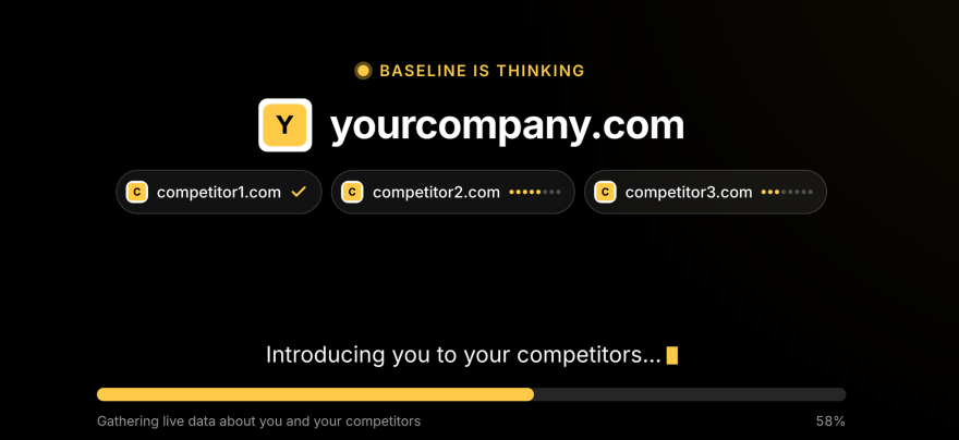
Baseline by Brew Digital

Not ready to get in touch yet?

Run your domain through Baseline and get an immediate picture of where your website and marketing performance sits against your key competitors. Free to use, results on screen instantly, no follow-up unless you want one.