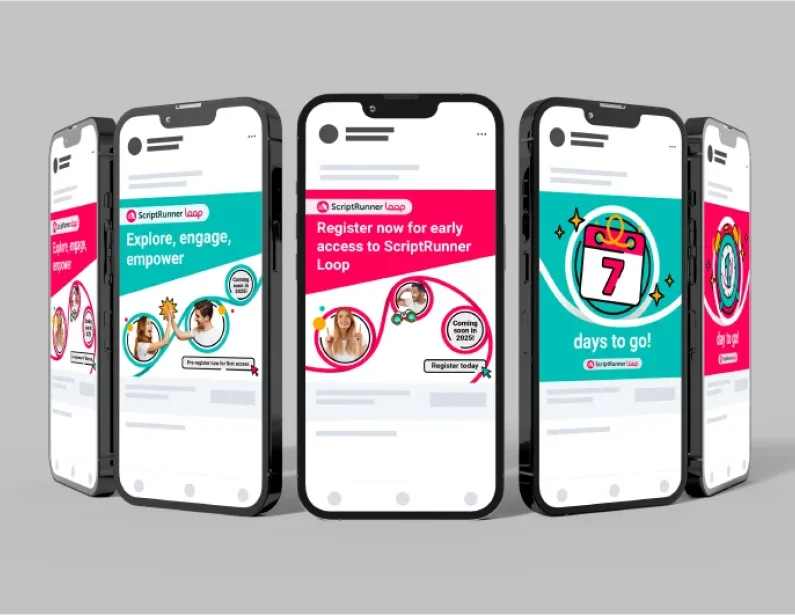
To ensure ScriptRunner was live as soon as possible, we structured the project to allow the brand development, CMS selection, and website build to happen concurrently.
Our partnership began with an intensive discovery day to define the project objectives, ideal user journeys, and core content types. This information was consolidated into a technical requirements document split into three phases, with each phase detailing "must-haves" and "nice-to-haves." This was also an opportunity to challenge the team’s assumptions about their brand and define exactly what they wanted ScriptRunner to represent.
While ScriptRunner conducted customer research to formulate their brand identity, Brew Digital began the technical website build. Through a rigorous process using the MoSCoW method, we captured 96 requirements from both Brew and Adaptavist stakeholders. We whittled a longlist of 18 CMS platforms down to a shortlist of eight, ranking each against the 96 requirements to find the perfect fit.
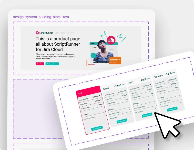
Using the insights gathered, we created an unbranded wireframe website that showcased industry best practices. A key objective was creating a scalable tagging system that could grow alongside the website, as ScriptRunner planned to launch additional products concurrently. We worked closely with their team to ensure the CMS met their immediate needs while providing the flexibility for future expansion.


