















Web dev built around commercial outcomes

Most websites aren't broken. Nobody has formally complained. But in the background, the site is quietly losing you business. Prospects check you out before a meeting and find a site that doesn't match the company they're about to walk into.

We put a number on what that's costing you and help you decide what's next.

Why do web development projects fail to deliver commercial results?

Knowing the site needs attention is the easy part. Working out whether the problem is the website itself, the marketing behind it, or something else entirely is where most projects go wrong before they've started. Here's what we usually find.

  • The brief skips the diagnosis.

    Most web project briefs start with "we need a new website" rather than "here's the problem we need to solve." Building before you've answered that question is an expensive way to fix the wrong thing.

  • The site underperforms quietly.

    Prospects are checking you out before meetings and finding a site that doesn't reflect the business they're about to walk into. That gap has a cost most businesses never measure.

  • The website and the marketing aren't connected.

    A new website without a digital marketing strategy solves half the problem. Without the right marketing behind it, even a well-built site is ineffective.

  • Commercial outcomes aren't built into the brief.

    Most web projects are scoped around design and functionality. The question "what does this need to generate?" comes later, if at all.

Photo of the Brew team in a meeting

Companies we work with

A green pie chart divided into four segments with gray borders on a white background.
White ECMWF logo with a stylized wave design to the left of the bold capital letters "ECMWF" on a transparent background.
White and teal text on a black background reads "patient safety learning," with "safety" and a large right curly bracket in teal.
Light green text on a transparent background reads "TaylorWessing."
Gold stylized wing logo next to bold gold text reading "JETMS" on a light gray background.
Empty white background, no visible logo or design elements.
The University of Western Sydney logo with the words "University of Western Sydney" in a modern, sans-serif font.
A logo with a stylized "S" icon in aqua and blue, followed by the word "Salable" in bold white text on a dark background.
White logo with large stylized letters "UEA" and the words "University of East Anglia" written beneath. A dark cross shape overlays the middle of the "E".
Blank white square with no visible logo or design elements.
Logo with three orange circles of varying sizes connected diagonally on a white background.
White "NHS" letters in bold, uppercase font on a blue background.
Logo for The Marketing Society featuring a black square inside a green rounded square on the left, with the words "The Marketing Society" in white text on the right.

The answer should always look simple. Getting there never is.

Your market is more important than our services menu. Before recommending anything, we understand who you're selling to, how they buy, and where the real commercial opportunity sits. It isn't about doing more. It's about being choiceful and focusing resources on the activity that moves the right buyers through the pipeline.

Then we make it look simple.

Simple enough that your team can explain the strategy. Your board can see the commercial logic. Your buyers get a coherent experience wherever they encounter you.


This is how we make you better

Illustration of four people sitting at desks with laptops, facing a large chalkboard filled with sketches of web layouts, documents, and profiles. The room has yellow walls, a clock, a calendar, a potted plant on a filing cabinet, and a trash bin.

Our case studies

Building an award-winning platform now used in 221 countries and by 92% of NHS Trusts

From a website that wouldn’t load to a 93% performance score and 6ms first input delay

Illustration of multiple web browser windows connected by a dark blue line, with several hands editing, drawing, and interacting with the largest window. Abstract shapes and design elements are scattered in the background.

Our web development team

The people you meet in the pitch are the people who work on your account. Here's who that is.

  • An illustration of Rob Parvin
  • An illustration of Derek Lawrie
  • An illustration of Jim Wigger
  • An illustration of Martin Short
  • An illustration of Danica Walpole
  • An illustration of Martin Sherwood
  • An illustration of Matija Janjic
  • An illustration of Will Stenner
  • An illustration of Ken Cheung
  • An illustration of Adam Fotheringham
  • An illustration of Damien Cook

Ready to talk?

Tell us where you are and what you're trying to solve. We'll take it from there.

Illustration of a diverse crowd of people drawn with simple orange outlines on a yellow background, with one central person in purple clothing and hair standing out and holding a phone.
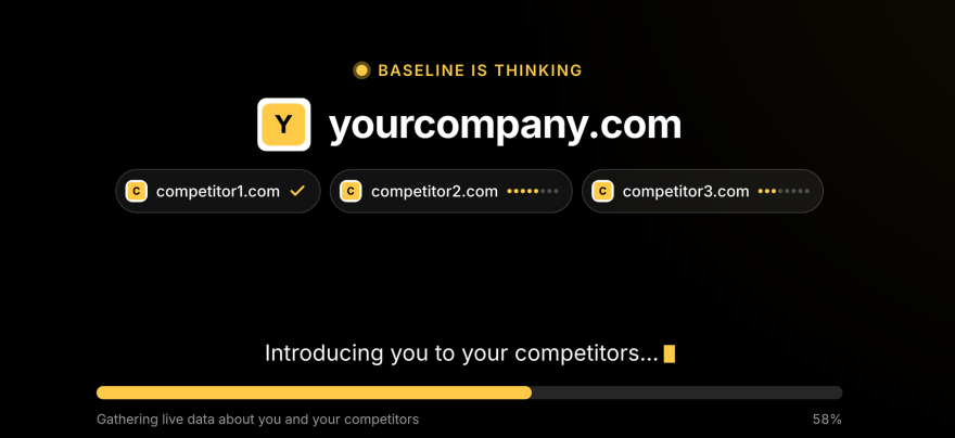
Baseline by Brew Digital

Not ready to get in touch yet?

Run your domain through Baseline and get an immediate picture of where your website and marketing performance sits against your key competitors. Free to use, results on screen instantly, no follow-up unless you want one.