Our partnership began with a series of discovery and conceptualisation workshops. Through these sessions, we established that the new identity needed to visually explain TAG’s role as an umbrella brand while remaining distinctive, energetic, and human-centric.
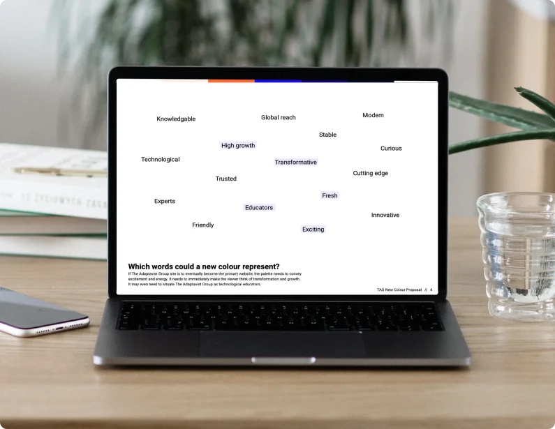
We conducted extensive research into global parent brands to identify a visual space where TAG could stand apart. This was paired with a deep-dive personality evaluation, utilising a "word cloud" of core values extracted from the brief and existing site. This data-driven approach allowed us to identify the specific traits the brand needed to evoke: expertise, vitality, and human connection.
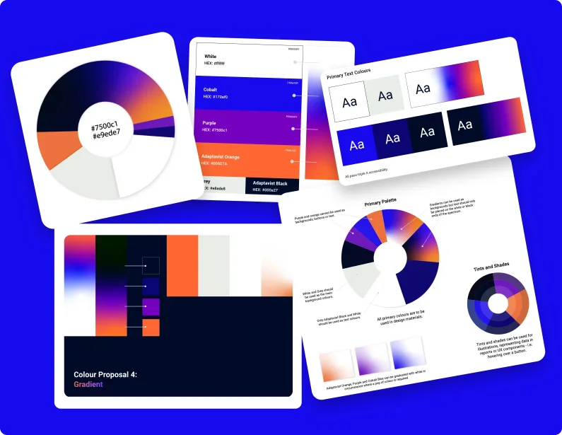
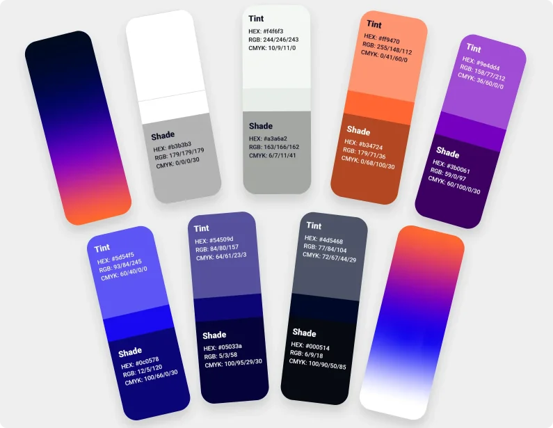
We scrutinised the existing colour palette to understand how different tones corresponded to TAG’s personality—identifying denim blue as a symbol of knowledge and orange as a representation of technology and energy. However, we found the palette lacked a sense of transformation and excitement. To solve this, we introduced a vibrant gradient palette. The sense of motion conveyed through these gradients provided the "invigorating" feel the brand was missing, symbolising the constant evolution and vitality of the group.
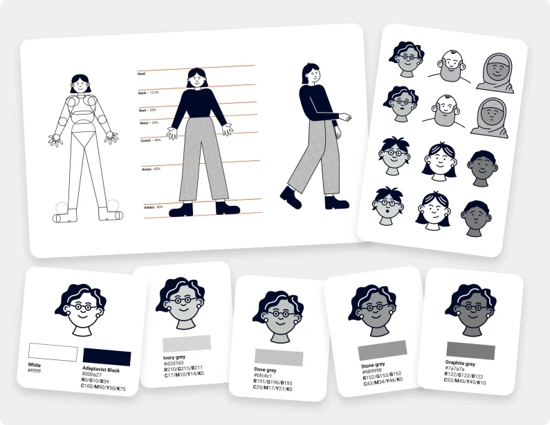
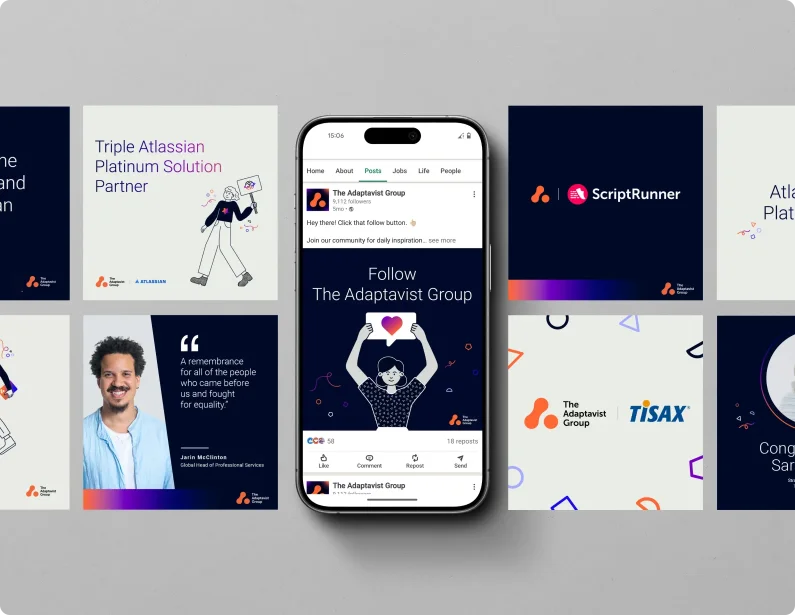
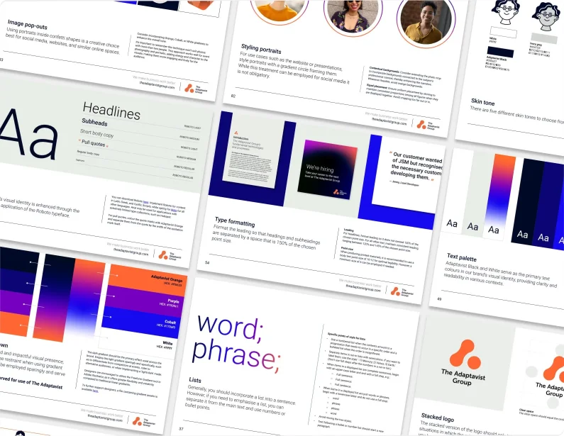
With the visual direction agreed upon, we moved quickly to build a comprehensive set of brand guidelines and a full suite of assets. This provided the technical and creative foundation for a total website redesign and ensured that the new identity could be applied consistently across all touchpoints.


